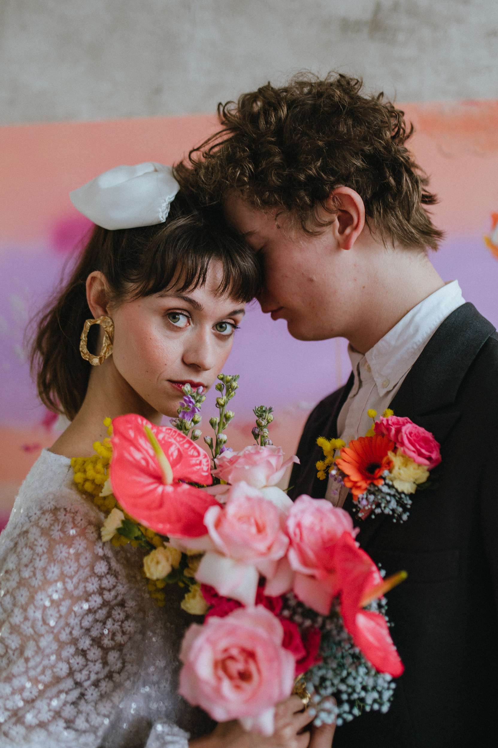
When setting the theme for your wedding, one of the most significant decisions you’ll make is deciding which colours to use. This choice sets the tone for the entire day, influencing everything from your decorations to the bridesmaid dresses, but it also sets the overall mood of the celebration.
In simplest terms, colour theory is a way to understand how colours interact with one another and how we perceive them. It also explains the visual effects of how colours mix, match or contrast with each other. Colours can affect our moods in different ways and knowing how to put them together will help you use them as an energetic tool rather than just something that’s purely aesthetic.
When it comes to planning your wedding colours, start by understanding the emotions and feelings associated with different colours. For example, red can symbolise passion, yellow is makes people feel happy, while blue can represent calmness. Choosing colours that resonate with the vibe you want to create can make your wedding that much more special.
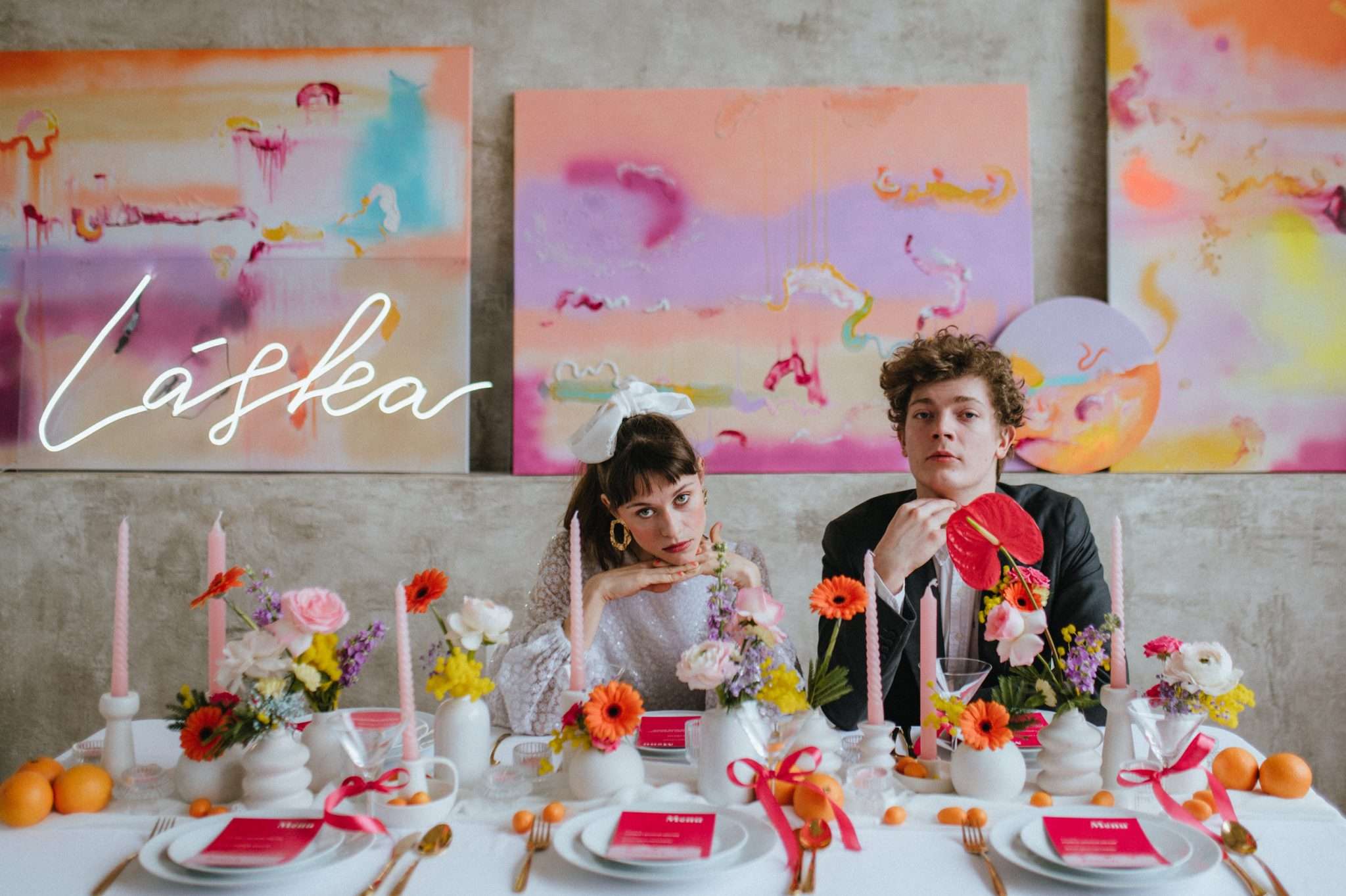
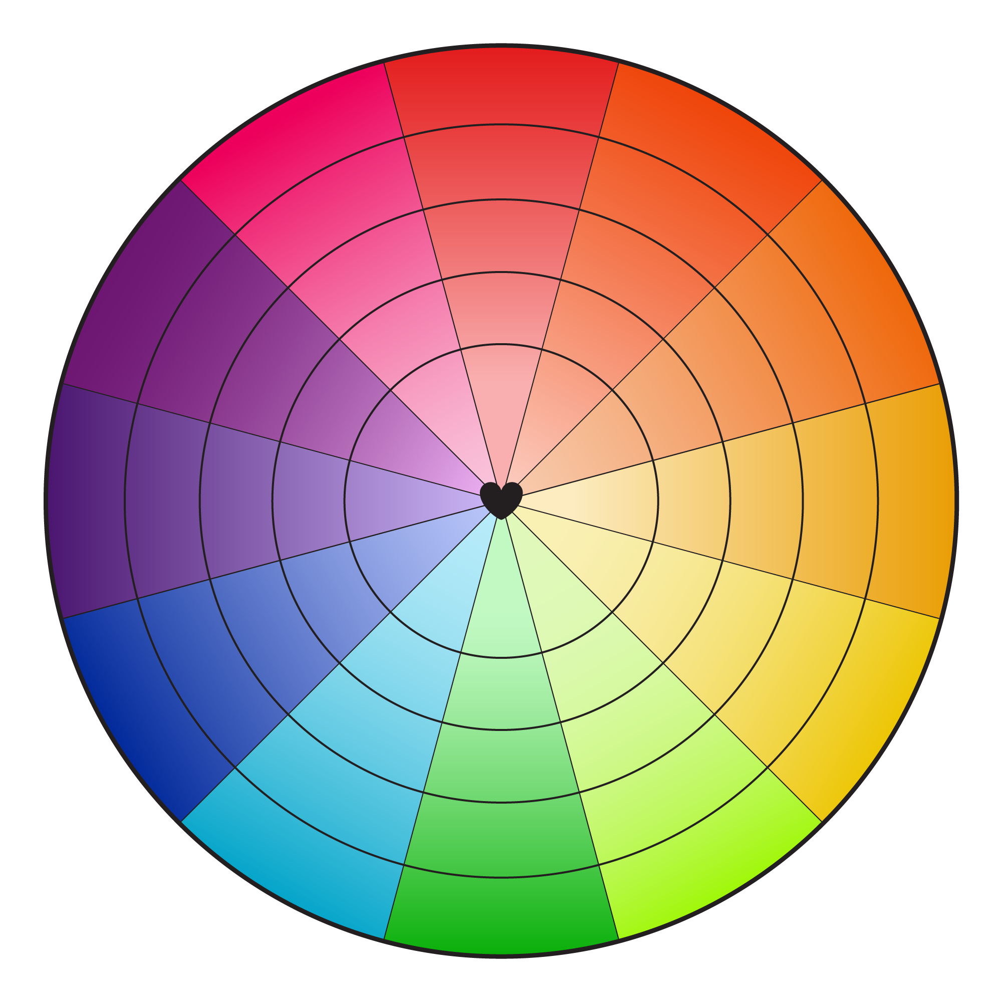
The Colour Wheel
This is a great place to start. Colours adjacent on the wheel are called analogous colours (such as blue, green and teal) they blend well together and create a seamless, harmonious look. For a bold contrast, pick complementary colours, which are opposite each other on the wheel like red and green or hot pink and turquoise. You can also explore triadic colours, evenly spaced to form a triangle, or tetradic colours, creating rectangles or squares, for more complex yet balanced schemes. Finally, a monochromatic scheme is made up of different shades of the same colour.
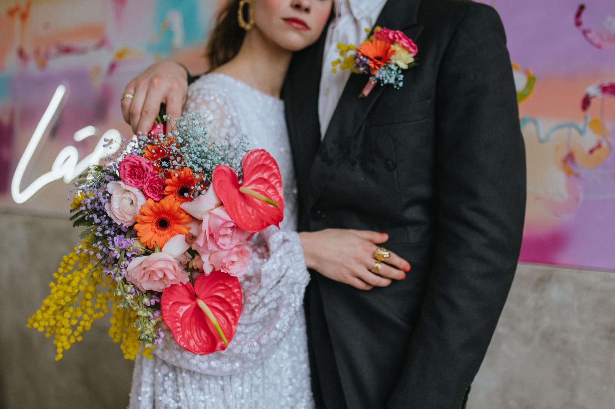
Undertones
The unification of the undertones of your chosen colours (unless your scheme is monochromatic where the unification is happening by way of the colour itself rather than the undertone) will ensure your everything works together. Try to keep the palette either cool or warm, not both. There is always a cool and warm version of the dominant colour so don’t worry about not being able to use a specific favourite.
How Do You Want to Feel?
Your wedding day is a reflection of you and your partner’s personalities and shared aesthetic. So, begin by asking yourselves how you want the day to feel to you and your guests. For instance, vibrant oranges and yellows can evoke a sense of joy and excitement, while a palette of deep greens and blues might create a more serene and intimate atmosphere.
Real Life References
The Colour Wheel is a great place to start, but it’s not your only resource. Look at colour combinations in everyday life that you love. Do you have a favourite movie or did you see a really cool floral printed couch at the thrift store? Or maybe there’s a Rothko painting that has you in a chokehold? It could even be your grandmother’s wallpaper that she refuses to change out. Thinking of these external inspirations will help curate a wedding that is unique to you and your partner and not just the same wedding that you’ve seen all over Pinterest.
Play with Saturation
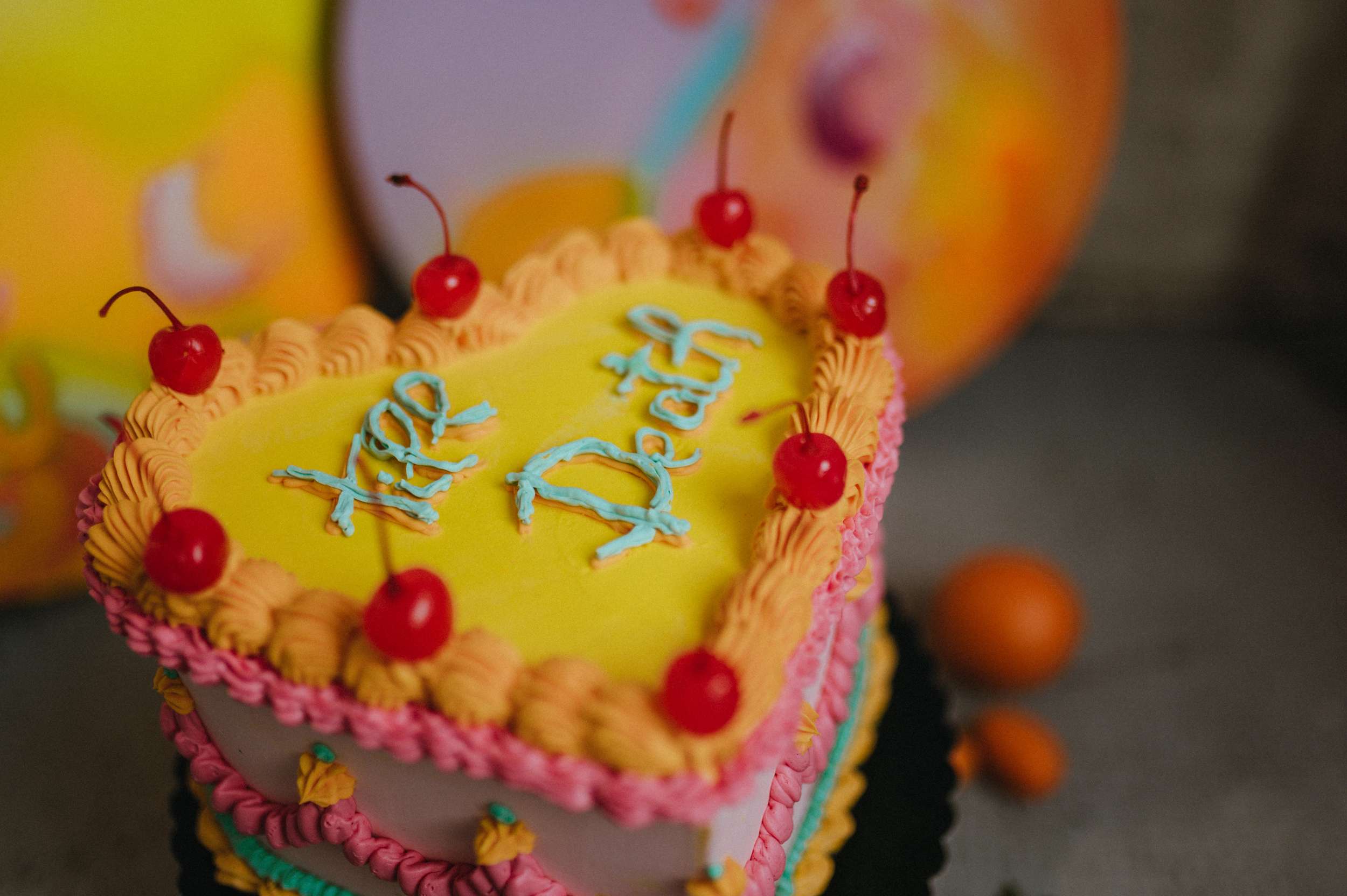
You might want to look beyond the fully saturated version of your chosen scheme too. For example, maybe you love the idea of purple and yellow, but it’s giving off LA Lakers vibes (nothing wrong with that if that’s what you want!) or you adore bright red and green but it’s feeling very Christmassy. Simply changing the saturation will transform it. Go for lavender and pastel yellow, or mauve and mustard to give a whole different feel. Those are fundamentally still purple and yellow, just different iterations.
Consider the Venue
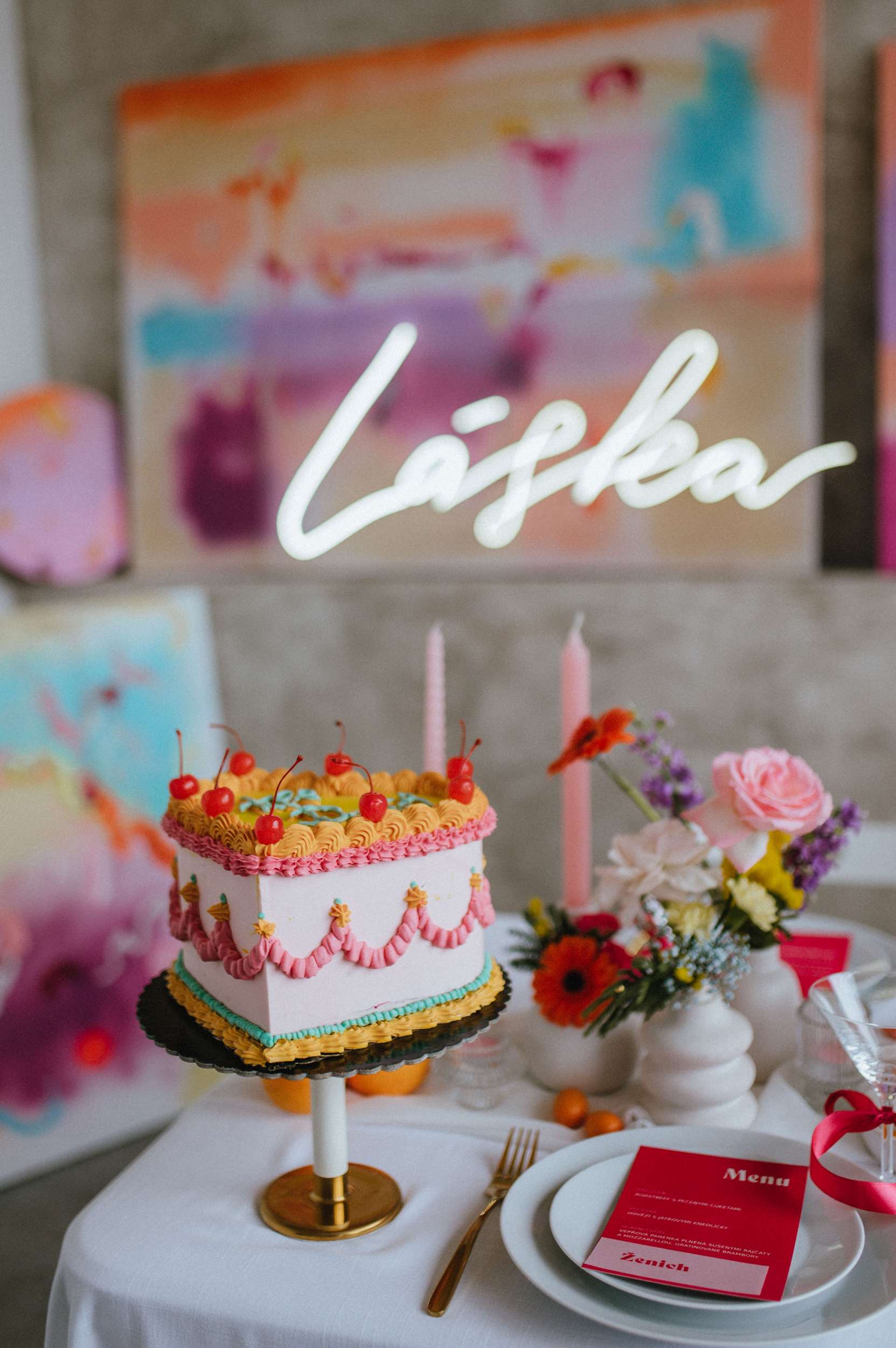
Your venue plays a crucial role in shaping your colour palette. The colour of the walls, carpet and décor will be your colour scheme whether you like it or not! That’s why blank canvas spaces are so great for colourful weddings. To get inspiration browse wedding venue marketplaces like Breezit and explore a variety of options to match your vision. A venue with rich mahogany wood would pair beautifully with warm earth tones, but would clash and look totally at odds with a bright rainbow scheme.
Consider Lighting
Remember, colours can change appearance under different lighting conditions. Test your colours by viewing fabric swatches or paint samples under the lighting conditions of your venue at the same time of day as your wedding will be held. Also take photos and video clips on your phone to see how things may photography (in situ).This is why you shouldn’t paint your house in Scotland to match your favourite hotel in Greece, even on the sunniest day the light is softer and it won’t ever look the same!
Additional Resources
Explore tools like the app ‘Drop’ or websites such as coolors.co and color.adobe.com. These resources allow you to experiment with different palettes and save your favourites for later reference. You can even upload photos of your venue or any inspiring images to see how potential colours might look in real life. The Complete Color Harmony (Pantone Edition) by Leatrice Eiseman and The Pocket Complete Color Harmony by Tina Sutton, are also great books.
Ultimately, while traditional colour theory can serve as a helpful guide, don’t be afraid to break the rules and choose a palette that truly speaks to you. If you’re drawn to unusual colour combinations that reflect your personal style, go for it! The most important thing is that the colours you choose make you feel happy and excited about your big day.
Special thanks to the following for their contribution to this article: Gabriela Rosales of The Stylist Witch, Emily Cailan of Set and Fury, Nikki Stark of Nikki Stark Jewellery, Rachel Gifford of Sans Grande Floral Studio and Rachel Smith of The Crafted Life.
This article originally appeared in issue 57 of Rock n Roll Bride magazine. You can purchase the latest copy here, or why not subscribe to never miss an issue?
Suppliers
- Photography: Kateřina Moravcová
- Styling & Flowers : Prostě Šťastná
- Hair & Make-Up : Veronika Karmazínová
- Cake: Kejky
- Paintings & Prints : Barbora Sika
