When it comes to running your own business, branding should be one of the things number one on your list to get perfect. Perfect branding will make you stand out from the crowd and will show potential clients exactly what you’re all about – even before they’ve seen your photographs/stationery/flowers etc – and before they’ve read one word about you.
This week, I thought it might be helpful to speak to someone who has gone through the re-branding process recently, with step by step examples of what they did and how they did it. If you’re thinking about your own branding but are struggling with how to go about it, then this article by Kerrie Mitchell is for you! Be sure to check out her new website after for the final result!
…And as ever, we’d love to hear your own stories in the comments please!
♥ ♥ ♥
When I started my wedding and lifestyle photography business, I was looking to get started quickly and as cheaply as I could. I had my portfolio built and a template website that I had modified to my best abilities but I was never really completely happy with it. However, it got me by for the first year.
Re-branding your business is a journey into your mind, a lesson in who you are and once you get started, a lot of fun. I wanted to share with you all how I went through the process and how, even if you can’t afford to use a professional designer, you can get started on creating your own personal brand.
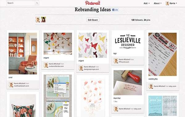
Pinterest is a great place to start, make a board and name it ‘re-brand’ and pin any images you come across that you absolutely love. This is a great excuse to while away hours doing research. Pin colours, textures, typography, clothing, furnishings, interiors, web design, layouts – you get the idea anything goes! At this point your focus should just be that you’re pinning only things you adore, don’t worry about how they’ll come together. Another option is to flick through magazines and rip out anything that catches your eye. Select magazines that you know your ideal client would read, and find inspiration. Look at store catalogues or look books of the shops you’d love to shop in if money were no object. For me that would be places such as Anthropologie or Liberty, This is a chance for your dream-shopping trip!
Here’s a peek at the board I created when I first started to think about my re-brand.
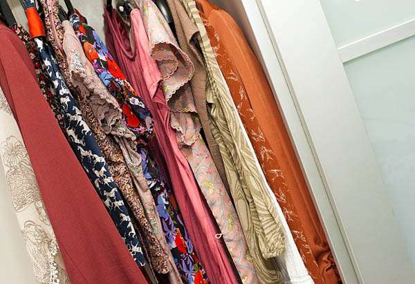
Another idea is to look in your wardrobe. Even if you’re not the most dedicated fasionista out there what you wear can say a lot about you. Perhaps you have a lot of floral items, strong prints or particular colours. Maybe you have a lot of tulle and lace, or prefer tailored structured items. This is all a clue into your inner mind! After using this technique I noticed I had a lot of colour, florals and pattern and liked tailored jackets and trousers as you can see from the image below.
Look back through your portfolio (if you’re in a different field than photography look at your favourite products) and pull images together that you love. These are the ones you want to represent your work. Think of the style, framing, emotion and colours. You should start to notice a theme in your work, which will help you to think about just who you’re trying to appeal to and who those ideal clients are. The ones I loved from my previous work are below.
I noticed similarities between all the images I’d selected – mostly that I love to use backlight and natural light to my best advantage, I prefer to capture natural and candid moments and to be quirky with my framing.
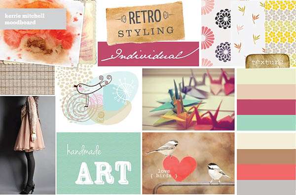
Once you’ve collected all of these ideas together, the hardest part is deciphering what you have and how to bring it all together. I decided to work with a graphic designer for my re-brand, as I knew from my last efforts that I just wouldn’t be happy with the result unless it had the professional touch. Melissa Love was my absolute saviour in this process; she took one look at my Pinterest boards and immediately saw a way to bring it together. Melissa then supplied me with her version of my ideas in the following moodboard.
For this article she explained her thought process to me, “[Kerrie’s] collection of inspirations showcased her love of retro typography and it was exploding with Japanese origami paper cranes, a quirky motif which we both felt we could use in an original way, an idea I began to explore when putting together her mood board.”
The next stage was to eliminate any images from the above moodboard that I just didn’t like. Being harsh and honest here is key. Once I’d done that I let her know which elements I absolutely loved which led us to this final moodboard.
Without me realising it, a brand started to appear. In this case we had pulled together colours, textures, patterns and typography as well as a quirky idea with the origami cranes. What excited me the most was that just looking at this simple moodboard I could see elements of things that I love and I immediately knew my new brand was going to be the perfect reflection of myself.
Melissa then got to work on my website design. I knew when I planned to re-brand my business that I wanted to use Showit as a platform for my website, as it’s a tool designed specifically for photographers and after your taught how to use it, making small changes or changing content is easy. I wanted to be able to control the content on my website and keep it updated and fresh, the control Showit gives me after the design process with Melissa is perfect for that. The day I received two layout examples in my mailbox was an exciting one, both layouts carried my brand but had completely different styles. One a more vintage and retro feel…
The other more contemporary with a nod towards the origami…
Anyone who knows me knows that I’m a terrible decision maker. A lesson Melissa learnt as I worked with her! I loved elements of both of these sites and we ended up combining the two. I was attracted more to the style of the second layout (I felt it was fresher and I was worried the first might pigeonhole me into the vintage style). However, I liked the idea of having a central box like the first layout. Luckily with the patience of a saint, Melissa went back to the drawing board and delivered this design, which was the one we finally settled on.
As you can see, we did away with the large amount of grey, lightening the overall aesthetic of the site. Contained the boxes into a box itself reminiscent of the first layout idea Melissa designed. We also brought the logo down into the navigation bar as it felt detached from the website and a bit small in the previous designs and finally you may notice, settled on a logo!
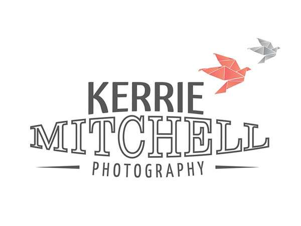
This was by far the hardest decision for me as Melissa supplied me with lots to consider. Some were very classic, others modern and she also supplied some with a slight retro feel. After looking back at my moodboard and considering how it looked in our initial website design I finally settled on the logo below to represent my business and brand.
This logo brought together all of the elements of the rebrand. It was classically simple with a retro twist and combined the origami theme of my website with the birds. I personally think it’s modern but also timeless, which will mean that hopefully my logo won’t ‘date’ too quickly. I now use variations of the logo with and without the birds across all of my business. As you may have noticed on the website, which has the logo contained in an oval.
My website is now a complete reflection of me and of how I want my business to appear. It’s light and colourful yet contained and easy to navigate. It encourages interaction with scrolling galleries and a fun contact page. Plus a page teaching you to make an origami bird! I can honestly say without Melissa it wouldn’t have ever become this gorgeous!
I’ve spent the Christmas break getting my visual identity together, making new stationery and preparing for some wedding fairs all with my gorgeous new brand plastered everywhere. You can see the break down of the design process through Melissa’s eyes here and of course visit the new and improved website here.
As you can see with a bit of hard work and by concentrating on elements you love as well as thinking about who you’re trying to sell to, you can come up with a completely unique identity for your business.
All Photography Credit: Kerrie Mitchell Photography


